Thursday, 31 March 2016
Tuesday, 22 March 2016

evaluation
My assignment brief was to pick my own theme which I was happy about doing because it’s the last project I’m doing on this course.
I have chosen zombies because I like the whole idea of survival and zombies attacking people. It was a topic that I really enjoyed doing because I am into my horror movies but I'm going to do it in a manga style (which means comics in Japanese). My zombies would be based on the virus type theme.
I have done some primary research and secondary research. I have read some books which I did reference on and I have used a website called Neil's Toolbox which was a helpful website because it was easier to use than writing out by myself. I also watched some anime called Kabaneri of the Iron Fortress which is about zombies. I have read some manga comics like My hero, High School of The Dead which I didn’t enjoy reading but I did enjoy Zombie- Loan because it had comedy in and I do like my comedy in the manga. I have done some research on character sheets for anime and games. I have researched some illustration & graphic work which has zombies involved. I have done some more research on weapon design. I did some research on a character called Trunks and he is from an anime called Dragon Ball Z. I found the referencing more difficult as it was something new.
I have made a questionnaire on SurveyMonkey which I posted in a group on Facebook. I have got a lot of responses which I was very pleased with my results.
What inspired me was the zombies research, because it has given me more ideas on how I could make my zombies gory in my comic script. I have done some research on my favourite manga artists who have inspired me. The character design sheet from Metal Solid Gears (Game).
I had made some comic designs which have been developed into a graphic poster which I have been developing in Photoshop and Illustrator. I have created some head shots, body position and weapon design and I have been using them to develop into a big character sheet design. I had also done a comic design idea.
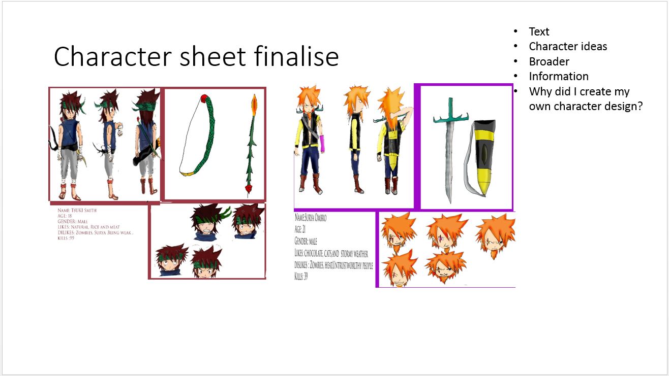
I have produced two characters called Surya and Tsuki, which I have been colouring in. Tsuki has a white skin tone colour and he is wearing a green headband and brown hair with red eyes. I coloured Tsuki’s top a blue eye colour and his trousers grey which suits with his white bandages around his arms and legs and his sandals are red. Tsuki’s bow and arrow are green, red, golden colour and flame colour. Surya’s skin colour is tan and he has got one golden eye and one black eye, he also got ginger hair. Surya has got a black and yellow shirt which is opened up showing his body muscle and Surya wears blue jeans with brown and silver boots. Surya has got a sword which is a dark grey and different shades of yellow colours. In the comic I have put a mix of colour for the background design. I changed the comics colour to black and white. I then added a blood shape tool which I coloured red, I have created a slogan in burgundy and black.
I have used Illustrator and Photoshop for my editing which I have enjoyed doing. I was using a graphic tablet which I draw in Illustrator. I have used a pencil to draw over my draft sketches. I have used Photoshop to colour in my ideas. I did not believe at first I would get it done by the end of the week, but I was wrong. I am proud of my development from sketchbook to Photoshop. I have done speech bubbles with a shape custom tool which I have used for several of my design ideas. I used the text tool to make SFX (sound effect) for my comics.
Yes, I have developed more new skills and I have developed my old skills which I am proud of doing. I have learnt new fill layer, burning & dodging, blending tools and the speech bubble technique which I have taught myself. The old skills I’ve developed are the pen tool and the lining tool. I have found the new layer tool quite difficult because you have to remember to unlock the layer before working.
I followed my daily list well but I have changed some of my schedules, because I had a day mixed up, but I have done my work. I had to change one of my plans for a personal reason because I organised to put my presentation on a different date. I don’t like doing schedules because I like to plan it out when I’m on the move, much better than planning for the future.
Yes, I feel like I have done my best, as I put all my effort into my design. I’d say the weapon design and page 3 are my favourite pieces because they have been well developed and detailed. I am proud of my work.
If I could have changed anything it would be my logo design for my poster because I could have made a cool logo design. There weren’t many font designs on Photoshop which could have gone with my poster idea.
When I was making my final piece I struggled to get the pen round some areas so that I could colour in, as some were difficult to get the pen round the shape of my character, but I have finally solved it as I sat still and I think that is how I got around the area. I struggled a bit with fill layer because I couldn't get the eye colour; which was white; which kept going to the skin tone colour, so I decided to do the eye before or rub it out.
What was my final piece aimed at?
My final piece is aimed is at both genders because I did add a girl zombie in my comic and it is aimed at teens and young adults. It also aimed at horror fans and zombies fan out there and probably manga fans too.
My PowerPoint went well but it looks like I did four FMPS instead of 1 and I had some great feedback from other students which was great. I should have checked my spelling and grammar before I did it.


presentation


Slide 3 :These are my production slides and I have been using 6 slides because I have done 3 designs for my final piece which I have been working really hard on for last couple of weeks.The sketches are little bit faint because of the scanner I have been using in the library and it as been stretched to this size because it wouldn't be able to put the other work on the slides and it would make me do more work that I should of done.


Slide 5 : This is my weapon design slide.It looks good but the sketches could have been shown a lot better. It could of been down to the scanner I have been using and it was a A3 scanner in the library and it is a old scanner.I should have put more stages on the sword but I have forgotten to do it which I am kicking myself for doing.


Manga scirpt reasearch

by:Ishida Sui
I like this layout a lot because it shows a lot of detail in the manga itself and I love the art style as I found it a really beautiful piece. It shows you a story without English translation, and I feel that it is kind of moving.

by: Ishida Sui
I found these layouts kind of confusing because I don't know whether it connects the top column or bottom column of the manga.The art style makes it really insane as you can see by the character and I like way the colour changes around on speech bubbles, as it makes it easier to read the page.

by:Ishida Sui
I found these layouts have been done separately because one has a 3D-ish look on Ayato (bottom corner). The shading really looks good on the pages as this shows a more characteristic style. I think they should have drawn the mask and hair with white sketch, as you would be able to see more detail on the hair. I would like to do these but I want to learn how to show more expression in order to create these kind of layouts.

By: Kishimoto masashi
I like this big layout because it always shows good action in these instead of the portrait style manga page. It also shows different characters in different positions, showing good characteristics close up and full body positions of the character. I like how it focuses on the character more than on the background drawing.
I would like to do something similar to this because it would be pretty cool to put on display.

Link:https://mangahelpers.com/forum/threads/luffy-vs-zoro-who-would-win.27047/page-9
This is one of my favourite moments because it shows how much respect Zoro has for his captain and how he would risk his life for him. I like the sound effects shown as it conveys more of the characters shock. The speech bubbles show the different reactions of the characters while they are speaking, it gives you more of an idea how they are feeling in that moment and I found it really helps you to understand the story better.

By:oda eiichiro
I found this part funny because it shows the 3 strongest team mates weaknesses in one page and it is also funny because they believe in the person who had said it. I like the shading style but I think it should have been less on the eye as it is a bit too much for this part. I would do something like this if there was a 1 to 1 battle because it makes an epic showdown for it.

By:oda eiichiro
I like this as it shows a lot of information in one page (2 pages condensed into 1 page) and the shading is really effective on the ocean as it makes for a realistic image like in the manga. I would do something like this because it would bring a lot of detail to my story idea.

By: Kishimoto Masashi
This is really emotional farewell, because Itachi shows his true self toward his brother. This layout is the best because it shows little detail at first, then shows something big or emotional towards the manga. I like the SFX on the bottom left column as it fits with the moment in the manga. I would do something like this for something emotional or a showdown between the bad guy and my character idea.
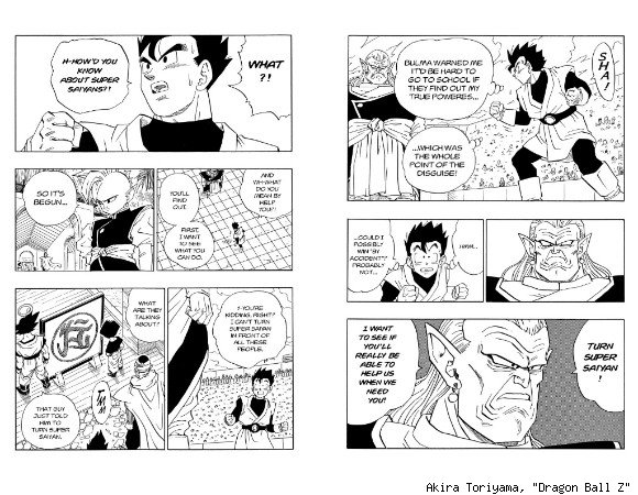
By:Akira Toriyama
This is what a manga book looks like, but online they are normally one page each, not two in the same page.
Well this part was a lesson because you shouldn't judge a book by its cover. I didn't think Lord Kai was a good guy, as he looked like more of a bad guy than a good guy. The layout looks good in this and I like how the artist chose a different viewpoint, looking down on the character in the manga. I would probably do something like this, but the problem is it would be on to one page not like this layout.

link : http://es.tokyoghoul.wikia.com/wiki/Archivo:Haise-0.jpg
By Ishida Sui
(I had problems putting the Name and Link underneath, so I had to put it on top)

Link:http://ardeearollado.deviantart.com/gallery/53254773/Comic-Page-Samples
By:ardeearollado
I like to see unprofessional manga work too, as you can see how good they are even though there are mistakes in the manga. I think I like the layout a lot because there is a part showing two sides of people's views while they are talking, and I think that is a unique way of doing it. I wouldn't do it like this because I think it looks too much for just one manga script and you can create as many pages as you want in the volume(1 book or 1 season) .

Link:https://vk.com/photo-1874674_343298590
By: kishimoto Masashi
This was a really good ending for the manga, because it shows that Sasuke was bottling up all his hatred and he was corrupted with darkness, which was kind of sad because what he went through was really hard. I think that he was similar to Kakashi in that he lost everything through war and stuff. The layout has been really good throughout because the detail in each slot is prefect and I have no problems with it.

By: Kishimoto Masashi
This is when White Zetsu changed into people that other characters know and makes them fight other, but it got sorted out by Naruto, I think. The drawings look different from the top image because these are from 4 years ago and the top one is from 2 years ago, so Kishimoto was still progressing in his drawing and all manga do this a lot. This is a good way for zombies to attack but it might be too much for 1 story, so yeah.

Link :http://ajourneyoftwo.blogspot.co.uk/2014/10/why-one-piece-isnt-bad-ii.html
by: Oda EiichiroThis was one of those goose bump moments because Luffy and the gang came to rescue Robin from the Government and the battle made you jump out your seat; it was one of the best battles up to that date. I would do this if there was a group of friends, but there are only two characters and I don't want to do too much for myself.

Link :http://hongtruyen.com/one-piece-chap-474/
By: Oda Eiichiro
This is a good layout because it added up to the middle part and it makes you excited at this point. I would like to do manga like this because it would make for a good conclusion for my story .

By: Ishida Sui
I love Suzuya because he is one of my favourite characters out of Tokyo Ghoul and he took on the twin ghouls like they were nothing to him. I still don't know it's gender. I would like to do it if I was drawing more then one page because it would make more sense of the story.

Link: http://www.deviantart.com/browse/all/manga/traditional/?offset=10&view_mode=2&order=14&q=Carnotaurus
By: Oda Eiichiro
This is one of the funniest tournaments that I have seen because Luffy changes their name to Lucy; a girls name. They had good fights in the tournament, which made it really cool. I like the layout as it adds up to the last slot which is in the middle. I would do something like this because it would make my character more detailed.
background research secondary

Link:http://www.fotografiaesencial.com/blog/2014/11/07/la-fotografia-entre-sombras-y-fondos-negros/
I like the light and darkness to the background as it makes me think of heaven and hell at war with the lightning strike. The sand looks like it is attached to the walkway because it is kind of the same colour. I would like to have a dark and light effect for my background because it would really make the zombies appear creepier on my upcoming poster.

By: Unknown
I like the vortex but not the background because it doesn't fit with my story.
By:Michael Kötter
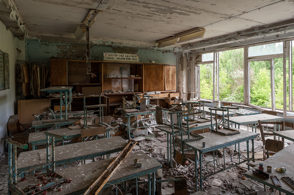
I like this background because all the collapsing stuff makes it really spooky to look at and it feels like someone is watching you in this picture. It would make a good place where zombies could lurk and they can get attached to the tables and chairs.

By:DesuDan
I like the mist of the background as it looks like it is coming towards you like poisoned smoke. I think the tree needs to be more creepy, as though the photo was taken in the winter, with the bare branches making the tree creepier then it usually is. I would do something like this but wouldn't put them on the whole image because it would look too much and you won't be able to see the tree in the background.

By:Adnan Karač
I like this because the muddy pathway looks like an endless nightmare that you cannot escape from.The deer looks like it is a ghost from the past because it appears to be disappearing into the mist.The trees look like they are reaching out to grab the deer.

By:Unknown
I found it weird background because of the pocket watch and face looks like they shouldn't be there at all; as they don't make sense with the building or the rest of the scene. I like the highlight and shades on the building as it reflects a lot. I wouldn't base my idea on this because it would have made it too much for me to do.

by:Balagur
I like this because it like an old Victorian era horror kinda looks to it. It looks like there been plenty of deaths happen in the village as you can see all the darkness crawling around the buildings.

Link: http://www.videocopilot.net/forum/viewtopic.php?f=4&p=299574
By: Daniel
I like this background because it shows peoples imagnation on space and plants out there and I like the dark and light contrast making the pathway glow. But I 'm wondering why is there a Starbucks cup there and I think it would look better without the cup as would look more moon like.


Link: http://wakamag.com/5-creepiest-abandoned-places-on-earth-you-might-wanna-visit/#.VzW1bIQrLcs
By: Sydney Chesterfield
I like this background as it is a really dark place but I wouldn't like to live there because I probably wouldn't sleep at all. I like how it is light down at the bottom and dark at the top, as it gives more of a spooky factor to it. It would be a great place for zombies.

By:JackEavesArt
I don't like the background that much as it is too dark to see anything, just a little light source coming through and it could of done a lot better than this. It would be good for a zombies theme though.

By:Oboi-Colibri
This is a really good background and it been done by a photography. It shows really good detail on the grass as the iSO makes it outstanding to look at and the view is really good.

By: AndyLee
I like how the fog smudges around the castle as makes it look older and spooky, like the past still remained there and we shouldn't enter the place. It would be good idea for the island full of zombies as they are kept in the past, if your think of ones coming out the ground .

By: Lauren Passell
It very old and look like the building go to fall apart by the root and dust lurking around the building.It very spooky looking at feel like someone standing at the door way.it be good place where they could experiment on zombies.

Link: https://www.walldevil.com/770110-welcome-to-milltown-wallpaper.html
By:nerraa
It remind me of storybrook from once upon a time , because of the clock building at the coruner. I like the moon light shiny on the road as makes it more spooky place .I wouldn't do something like this for zombies as it makes lose the background.
Subscribe to:
Comments (Atom)