first page :
Tsuki : No way out of this. By the looks of it, I'm going to die in this stupid world.
Surya: Not with me around little punk.Lets team up and defeats these corpse. What ever your name is?
Zombies: GRAWLSS!!!
Tsuki: Name's is Tsuki, but you're to weak for me and I like to be alone, so I don't lose to the dead.I will defeat every zombie on earth, even you're in heaven, I will still defeat you. You're not gonna run or hide from me maggot as I will send you to hell. My bow is full of death and the black rose will make you my 89 Victim, You shall perish in hell. My score is rising and the earth will be mine.
Middle page:
Zombie:ERRRR!!
Surya:Nice try but it doesn't work on me unless you have brain or two Zombie.
Tsuki: No can defeat Surya beside me, dead waste.
Zombie: GRAWLLL!!!!
Tsuki: ananananananana take that and go to hell with your little friends.
Surya: sorry tomato, but my life come first.
end page
Zombie: warahaha
Tsuki: Damn it. Surya let get out of here alive even if ,we against a thousand
Surya: No tsuki this time you go and brings humanity back. You are going to meet new people, but this worlds is full of lost and untrustworthy people, but let storm bring back the peace
Tsuki : WHY,WHY,WHY?!. Did you after die for me .
Showing posts with label progess Work. Show all posts
Showing posts with label progess Work. Show all posts
Wednesday, 18 May 2016

Thursday, 5 May 2016
character detail and comic Title
Frist name :Surya ( mean sun in Bengail )
secound name: Ombro ( Mean shadow in Esperanto)
Age: 20
D.O.B: 25/7/2096
Gender : Male
hieght:5 ft 9 in
Wieght:15 stone
Weapon: Sword
like: chocolate,wind,lions
Dslike:Zombies,Untrustworlthy people
How many kills: 39
b.i.o: Surya was born in Bengail but is mother Esperanto who moved to the UK by the age of 3. when he was 5 his parnets was killed by zombies who turn them against him while he cryed and screamed for help when a Lion and man killed his partents with a grin on the faces.Ever scince that day Surya been travling UK untill he was 12 years old ,when the man sacfirce himself from the zombies by letting Surya left the contury to Japan as it throught was safe.
Personilty : Stubbon,cheerful ,short-temper
Frist Name:Tsuki
Secound Name:Smith
Age:18
D.O.B: 13/6/2098
gENDER : Male
hieght: 3ft 9 in
Wieght:8 stone
Weopon: Bow arrow
Likes:Rice and meat .Rain,wolf
Dislike: Zombies,Surya and being weak
How many kills: 99
B.I.O : Tsuki is half Japanese and britsh boy when zombies bitten both his parnter Tsuki killed them with a knife when he cried with pain and then he strated slaughter 15 zombie untill he collpase when dog saved him and dragged him out of danger.when Tsuki was 12 he started killing zombie from his home ,when put arrow on Surya neck what nearly killed him.Tsuki then became rivals and parnter killing all zombie on earth.
personilty : Insane, unfeared,strong,
Titel: The beast vs Zombie Apcolpse
secound name: Ombro ( Mean shadow in Esperanto)
Age: 20
D.O.B: 25/7/2096
Gender : Male
hieght:5 ft 9 in
Wieght:15 stone
Weapon: Sword
like: chocolate,wind,lions
Dslike:Zombies,Untrustworlthy people
How many kills: 39
b.i.o: Surya was born in Bengail but is mother Esperanto who moved to the UK by the age of 3. when he was 5 his parnets was killed by zombies who turn them against him while he cryed and screamed for help when a Lion and man killed his partents with a grin on the faces.Ever scince that day Surya been travling UK untill he was 12 years old ,when the man sacfirce himself from the zombies by letting Surya left the contury to Japan as it throught was safe.
Personilty : Stubbon,cheerful ,short-temper
Frist Name:Tsuki
Secound Name:Smith
Age:18
D.O.B: 13/6/2098
gENDER : Male
hieght: 3ft 9 in
Wieght:8 stone
Weopon: Bow arrow
Likes:Rice and meat .Rain,wolf
Dislike: Zombies,Surya and being weak
How many kills: 99
B.I.O : Tsuki is half Japanese and britsh boy when zombies bitten both his parnter Tsuki killed them with a knife when he cried with pain and then he strated slaughter 15 zombie untill he collpase when dog saved him and dragged him out of danger.when Tsuki was 12 he started killing zombie from his home ,when put arrow on Surya neck what nearly killed him.Tsuki then became rivals and parnter killing all zombie on earth.
personilty : Insane, unfeared,strong,
Titel: The beast vs Zombie Apcolpse
Wednesday, 13 April 2016
develop into a grapthi piece

Adding my two main characters.


I then added the eye from page 3 which made it look like you are zooming into the eye itself.

I have used the blending tool to make the eye fade as I didn't want to show too much detail of the eye.

I have added a slogan and some other tools like lighting and flare which can make it into a cool poster design which makes it look effective within the background design.I think photoshop should have more flare tools as it would make my poster look a lot better.


sketch character design (1 & 2)


comic script page 1 developing

This is my sketch and you can see I have made some mistakes and the coloring looks a bit rushed, but I have fix them in photoshop which has helped me to develop my ideas more. My design has got more gorey than the drawing - that is what I am aiming for . I have used a A3 sketch book and pencils and used gel pen to neaten up the drawing more I have used a metal ruler which has made it a lot easier to draw in the boxes of my idea

This is my digital drawing in illstartor and I am very proud of the out come as looks very cool and I am very proud of my comic script. I have been using the pencil tool and rubber tool which aren't as many tools but it did take me hours to compelete it and it was difficult getting the tablet but I wish I could own one but they are expensive. I will be adding my speech bubble text and SFX (Sound effect) after I have done coloring in the comic as I would know where to put it and not let the colour mess up the SFX text.
 This is when I colour in the outside boxes in photoshop which was easy to do and Photoshop is good for editing things like these.Some parts have been taken off because only the outline would fit on the page.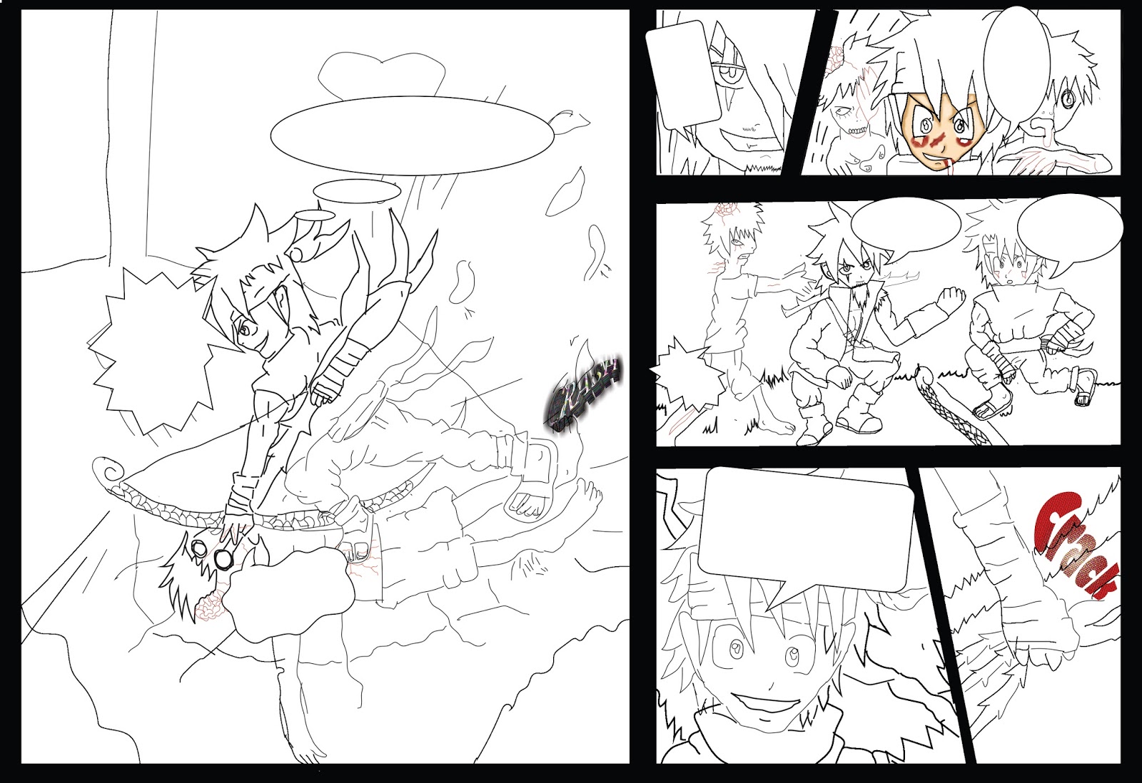
This is when I have started colouring in photoshop. .

This is my development with the colouring on my zombies in which are looking cool .

I have started colouring on the 3rd section and Tsuki (left side) looks good and I would have done some better shading on the clothes as they look a bit scruffy.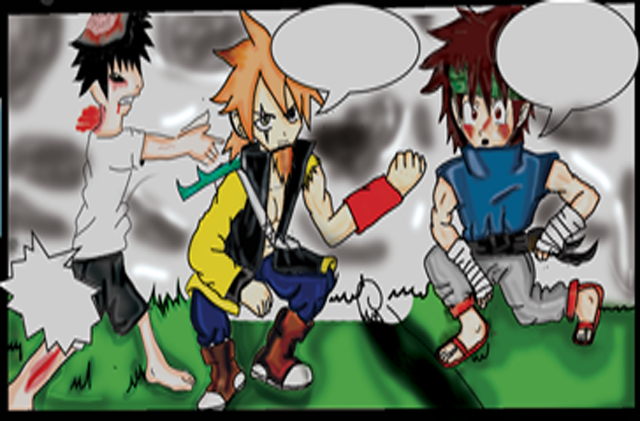
This is the 3rd section of page one which is blurry as I used the cuting tool to paste it onto a new page in Photoshop which I would do again. I will be adding text after I have done my colouring because the coloring would take over the writing and I don't want that to happen. I have used a new fill layer to make the base colour of my character I then used a brush tool to add light shading to the characters then used the burning and dodging tool to bring more dark colour and lighter colour to my character . I have used a pen to pick area that needs coloring I have also used the adding anchor tool so I can make it tidier for me to colour I have used the blurring tool to blend with my character tones so it doesn't look like the shading colour takes over the base colour of my characters.I really like the outcome of my comic as it looks more anime which I didn't think it would happened out like this because I through it might have been dull .

This section 4&5. I like the grabbing of the bow and arrow as looks a really effective piece of work because the flames are really active I'm really good at coloring flames with crayon so it would have made it look 10 x better in photoshop. On the 5th background something is going to happen as you can see with my character tsuki grinning as he his ready to attack. The zombies on section 3 the bandanna shading looks as if it is reflecting his evil move that he his going to make which is on section 6. I did it yellow because I want to make it stand out with the characters emotion for the move.

I think the last section has really good detail which has more than my other drawings and this is my first page so it would be a little rough. I like the blood effect but I wish I had made it more gory as I think it looks too basic.The background shading looks more detailed than the character which I wish I could have done better on my design .The speech bubbles suit the action on the section which I layed out well for my design.

This 1st section and 2nd . I like the zombies design on the first one as they look really gore.y
I'm really proud of the effects of the blood and I think I have done the brain better because it looks more like grapes then a brain . My character Tsuki (middle) really is standing out.In the second I like the grin as it looks evil which I'm trying to make people think because of the scar on my character Surya who on section 2 . I wish I hadn't added the snow as I was trying to make a rain effect that has failed. I was struggling to do this because it was half term and I don't haveaa tutor to ask about my work ideas.
Tuesday, 22 March 2016

weopon designs

Sketch out before illustrator.
This is bowing arrow and I do like the design but I think look more amazing in colour ,that is coming soon.I used a HB pencil to draw and A5 sketch book to draw my ideas on .I have use the scanner from the libvery as i found more easy then using a phone camrea .


This is my colour arrow and the sketch out bow which I am proud of the design idea because the colour suit well and pretty well design and I like the shades and highlights which makes really good arrow design . I have used fill layer tool which makes basic colour first I then blended it with the darken tool which makes the outline go in front of the colour I have used brush tool for basic shading I then went on to bruning and dodging which makes more shading and higlight colour on my arrow I then blur it so I create more cool deisgn for my idea

I have change my idea on the bow abit because I didn't like that much but I have kept with the patten as they are lefts with a rosa on top with golded stun so they can keep the string in place and to make it strong another to aim at the emeny . I used the same tools with the bow but I left the string in the same colour because it wasn't that much of a bother for me todo .

This is my full colour sword and case which I like a lot but mostly I like the blades as it really shiney and refelect piece of work but I wish I could made handel like the blade as it makes more stylish weapon design.The case looks like a case which I like a lot because it shows good shading and highlights of the image.
broader of comic


You cleck the line tool or you can do with the rectangle tool but I decided to do it with the line tool as it would be quick and simple to create

You then click on the pen tool which makes the line into a basci line which is weak then line before . I then right click ont to Make selection which would make visble line I then put paint can over the line which create dark line so it could help me where I can colour my comic


You then merage the layer into one so you don't go over the broader of your drawing,
speech bubble step by step

you frist go into shape tool and click on custom shape which would lead you to a bar with different custom shapes ,web buttons, sign and many more shapes

This is different type of speech bubbles I did.

Then you create the temple and put it in the comic

when you done added text with the texting tool which look like "T"
develop character (in Illstartor )


My own character sheet design

This is my draft idea before I start doing the character sheets and they are going to be added into the headshot box because on my other headshots there were ones I didn't like and I will be replacing them with these characters.


This is my first character his name called Tsuki (means"Moon " in Japanese ) smith .I only colored half of them ,as I don't have much time to colour in as the weeks are getting closer.I like this character a lot because the drawing are my original style and I found out that I have got other styles then my previous styles. The inspiration on the character is from Metal Solid Gear with the headband because it one my favorite games out there because it has a really good story line.The character sheet is really cool too but it would look really cool when it is be polished in illustrator.


Used and equitment:
A3 paper : It really good paper to draw on ,but the size is small and it is down to me get my drawing done on paper.
Pencil HB: I like using HB doing Manga characters because it really soft and better pencil to use.
A3 scanner: The scanner did a good Job :)


These are my full colored head shots and I do like the shading of the character as it shows a really good depth of the characters head shot.I think I should have made the hair more ginger because it was a bit brighter then the shading colour should be.

This is my body postion in progress. It looks blurry because I have lost the original version of my illustration sketch . I did post them on my blog, I was happy about it but it made the characters look blurry and but it did make them look like a 2D gaming character which makes it look unique .I have shaded the trousers too much so I should have blurred them out more or added colour in the trousers again.

I like the outcome but I think this sketch could have been improved by redoing it in Photoshop but I didn't have much time so I had to risk it looking like this.On the sword again, I put too much shading on it and can't see the solid colour which is grey but could colour the handle a lot better.


This is my 2nd character sketch on illustartor which is software I used.I like the sketch but there are some missing, probably I used smaller size brush and didn't appear on the JPG file.I think I could have it done better then the hair style on the side view as looks like it is one sided hair which would look funny.I really like this sketch a lot and it is one my favorite characters

This is when I was developing my character in Photoshop and the shading looks a lot better than my first character probably because it shows really good reflection of the character.I think the colouring looks better on s theideview then front view as it has got more shading on the character.

This is my finshed design and it looks really good but it still has mistakes in my sketch. The belt and the outline are too dotted in my opinion .I should have done the bow a bit better as in my weapon design .


Tsuki's finsh character sheet and I am proud of my design .
Subscribe to:
Posts (Atom)