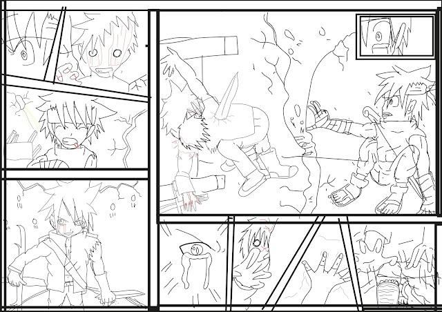
This is my sketch on my last page. This is my rough sketch before I have developed my drawing onto a graphic tablet.I have used my sketch book,pencils, metal ruler and some fabric colors which are good but if I had time to use them more I think it would look better.I used a scanner to scan my work on a computer.
 This is my outline drawing.I have been using Adode illustrator to draw out my sketch again which I have been using a graphic tablet for my drawing. I have been moving class rooms and I did find it peaceful for me to my work on.The border has taken some of the room on my sketches but thats how it happens..... . I have used a pencil tool.
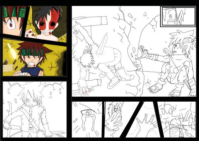
I have finished coloring section 4 & 5. it is making progress on the page, I thought it was not going to work but it looks a really cool design and I like the eye effect more. I have used the same tools for my previous post but I did use the rubber tool to rub out the eyebrows so I could see it a lot better. I think the blood should have been done a lot better on the 4th the section.
I have finished my design on section 5th,6th,7th, part 8, & 9 are really good. I did struggle on doing my 7th because I did not know where the back of my characters feet were so I struggled figuring out where it is but I work around the problem. I also noticed that I do good toes even on 8th section they are both right footed. I forget to add the bandages which I had to add back on my character using photoshop as I didn't have Illustrator at home. I like the last section eye as it give the character an emotional feeling to him. I am beginning to like my page a lot..
The 9th section is coming along well and I like the blood effect on the zombie shirt as it shows two colour effects on the character. I've done the blood really well but could improve on the blood a bit better . Tsuki (left character ) looks really good and I need to improved my sideviews a lot more but I still need to practice which I am doing over half term for the next course.
Section 9 has got a lot better as the background is added and I have used the dodging tool to make it a lot better too . I like the light and dark part which shows two different sides of the story. I think the character have been developed well in a short time.
This is my comic script and it has been checkd and corrected by a Teacher assistant.I have created the speech bubbles in photoshop by using the custom shape tool. It has more of a variety than CSS than CS2.So I had to wait untill I got back to college which took some time.


A very thorough and detailed account of your development, your work is very strong and you have a very clear understanding of your process, be sure to proof read your annotations.
ReplyDelete