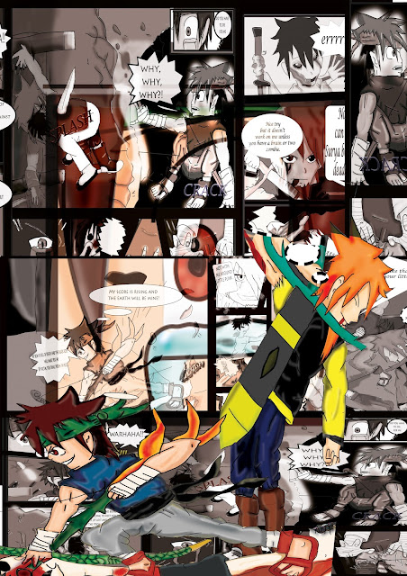
Adding my two main characters.
I did struggle to fit the comics on but I decided to mix them all up so they could look good and random.
I then added the eye from page 3 which made it look like you are zooming into the eye itself.
I have used the blending tool to make the eye fade as I didn't want to show too much detail of the eye.
I have added a slogan and some other tools like lighting and flare which can make it into a cool poster design which makes it look effective within the background design.I think photoshop should have more flare tools as it would make my poster look a lot better.
This is when I'm deicing if to invert or a red background. I have created the slogan which I think looks kind of weird to me. In the end I did decide on my poster idea .I have added blood templates to my poster instead as it looks better then the invert and red background design. I have removed the green colour on my slogan as makes it more blood like.I do like the poster now.
I add the title of my comic and it is in the invert colors


No comments:
Post a Comment