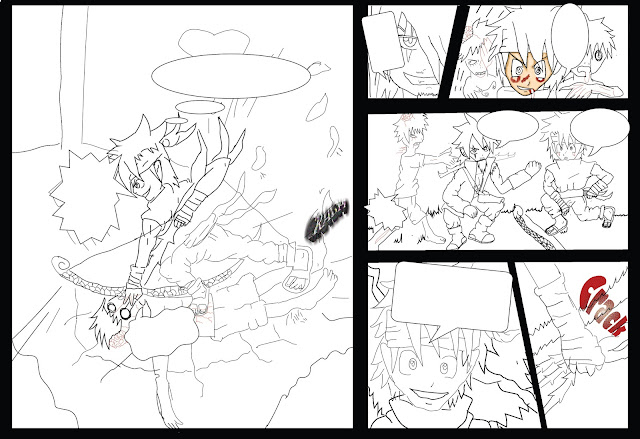
This is my sketch and you can see I have made some mistakes and the coloring looks a bit rushed, but I have fix them in photoshop which has helped me to develop my ideas more. My design has got more gorey than the drawing - that is what I am aiming for . I have used a A3 sketch book and pencils and used gel pen to neaten up the drawing more I have used a metal ruler which has made it a lot easier to draw in the boxes of my idea
This is my digital drawing in illstartor and I am very proud of the out come as looks very cool and I am very proud of my comic script. I have been using the pencil tool and rubber tool which aren't as many tools but it did take me hours to compelete it and it was difficult getting the tablet but I wish I could own one but they are expensive. I will be adding my speech bubble text and SFX (Sound effect) after I have done coloring in the comic as I would know where to put it and not let the colour mess up the SFX text.
 This is when I colour in the outside boxes in photoshop which was easy to do and Photoshop is good for editing things like these.Some parts have been taken off because only the outline would fit on the page.
This is when I have started colouring in photoshop. .
This is my development with the colouring on my zombies in which are looking cool .
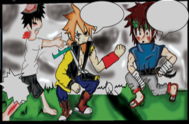
I have started colouring on the 3rd section and Tsuki (left side) looks good and I would have done some better shading on the clothes as they look a bit scruffy.

This is the 3rd section of page one which is blurry as I used the cuting tool to paste it onto a new page in Photoshop which I would do again. I will be adding text after I have done my colouring because the coloring would take over the writing and I don't want that to happen. I have used a new fill layer to make the base colour of my character I then used a brush tool to add light shading to the characters then used the burning and dodging tool to bring more dark colour and lighter colour to my character . I have used a pen to pick area that needs coloring I have also used the adding anchor tool so I can make it tidier for me to colour I have used the blurring tool to blend with my character tones so it doesn't look like the shading colour takes over the base colour of my characters.I really like the outcome of my comic as it looks more anime which I didn't think it would happened out like this because I through it might have been dull .
This section 4&5. I like the grabbing of the bow and arrow as looks a really effective piece of work because the flames are really active I'm really good at coloring flames with crayon so it would have made it look 10 x better in photoshop. On the 5th background something is going to happen as you can see with my character tsuki grinning as he his ready to attack. The zombies on section 3 the bandanna shading looks as if it is reflecting his evil move that he his going to make which is on section 6. I did it yellow because I want to make it stand out with the characters emotion for the move.
I think the last section has really good detail which has more than my other drawings and this is my first page so it would be a little rough. I like the blood effect but I wish I had made it more gory as I think it looks too basic.The background shading looks more detailed than the character which I wish I could have done better on my design .The speech bubbles suit the action on the section which I layed out well for my design.

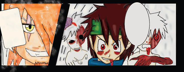
This 1st section and 2nd . I like the zombies design on the first one as they look really gore.y
I'm really proud of the effects of the blood and I think I have done the brain better because it looks more like grapes then a brain . My character Tsuki (middle) really is standing out.In the second I like the grin as it looks evil which I'm trying to make people think because of the scar on my character Surya who on section 2 . I wish I hadn't added the snow as I was trying to make a rain effect that has failed. I was struggling to do this because it was half term and I don't haveaa tutor to ask about my work ideas.


No comments:
Post a Comment