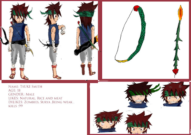
This is my draft idea before I start doing the character sheets and they are going to be added into the headshot box because on my other headshots there were ones I didn't like and I will be replacing them with these characters.
This is my first character his name called Tsuki (means"Moon " in Japanese ) smith .I only colored half of them ,as I don't have much time to colour in as the weeks are getting closer.I like this character a lot because the drawing are my original style and I found out that I have got other styles then my previous styles. The inspiration on the character is from Metal Solid Gear with the headband because it one my favorite games out there because it has a really good story line.The character sheet is really cool too but it would look really cool when it is be polished in illustrator.
This is my other character Surya who is repsented by a lion because they are really powerful and procetive of their family and friends and thats what the Surya character is and you see it in the comic script .I think the colour and outline are going make this character really cool.
Used and equitment:
A3 paper : It really good paper to draw on ,but the size is small and it is down to me get my drawing done on paper.
Pencil HB: I like using HB doing Manga characters because it really soft and better pencil to use.
A3 scanner: The scanner did a good Job :)
This is my illustration sketch of Surya it looks cooler then the original sketch.
These are my full colored head shots and I do like the shading of the character as it shows a really good depth of the characters head shot.I think I should have made the hair more ginger because it was a bit brighter then the shading colour should be.
This is my body postion in progress. It looks blurry because I have lost the original version of my illustration sketch . I did post them on my blog, I was happy about it but it made the characters look blurry and but it did make them look like a 2D gaming character which makes it look unique .I have shaded the trousers too much so I should have blurred them out more or added colour in the trousers again.
I like the outcome but I think this sketch could have been improved by redoing it in Photoshop but I didn't have much time so I had to risk it looking like this.On the sword again, I put too much shading on it and can't see the solid colour which is grey but could colour the handle a lot better.
This is my character design sheet and I am happy with the outcome as it shows good detail of the character and you know about the character it self by the information in the right bottom corner. My favorite out of the all character sheet is the sword. On all theses I used the fill layer tool,blur tool,burning and dodging tool & blending tool.
This is my 2nd character sketch on illustartor which is software I used.I like the sketch but there are some missing, probably I used smaller size brush and didn't appear on the JPG file.I think I could have it done better then the hair style on the side view as looks like it is one sided hair which would look funny.I really like this sketch a lot and it is one my favorite characters
This is when I was developing my character in Photoshop and the shading looks a lot better than my first character probably because it shows really good reflection of the character.I think the colouring looks better on s theideview then front view as it has got more shading on the character.
This is my finshed design and it looks really good but it still has mistakes in my sketch. The belt and the outline are too dotted in my opinion .I should have done the bow a bit better as in my weapon design .
This is my development of my head shot as you can see they are getting a lot better in the coloring and shading, they are tidier than before .I have re organized my head around and removed some because they didn't look that appealing to me because some drawings looked too messy for my final design.The tool I used to get rid off the pixelated the area were called "High pass" which is very good tool to use by the way.This is my finished head shots and the coloring looks really good. I like the head shots more then the body positions because it has more detail .The first head shot was my first design idea so I had to change it and re do the coloring but I could not do the hair as it would have only removed the whole thing and I did this before I learnt how to use the fill layer tool.
Tsuki's finsh character sheet and I am proud of my design .


No comments:
Post a Comment