Slide 1 : Welcome to my introduction slide on a software called powerpoint that I've been using to do my presentation on and I have been showing this PowerPoint to my tutor so I could get feedbacks on my final piece and the presentation I have created. I have decided to put a little preview of my latest comic design in the background. I only put it on one slide not on the other 12 slides I've created . This is one of my favorite zombies sketch and it will show in my comic design.
Slide 2: These are my research slides. I have been picking some of my favorite research that has been inspiring me on my blog post and I have put them into my PowerPoint slide. The research I have got makes me like it because they had the most detail and it as the most inspiring for me, it could have help me with my final design ideas .I have used bullet points, so I could ask question and I would know what I'm talking about . It shows that I could answer them and know what I am talking about.

Slide 3 :These are my production slides and I have been using 6 slides because I have done 3 designs for my final piece which I have been working really hard on for last couple of weeks.The sketches are little bit faint because of the scanner I have been using in the library and it as been stretched to this size because it wouldn't be able to put the other work on the slides and it would make me do more work that I should of done.
Slide 4 :This slide shows the characters in full colour and again I have been using bullet points. It has shown good detail of the characters design which I really liked.
Slide 5 : This is my weapon design slide.It looks good but the sketches could have been shown a lot better. It could of been down to the scanner I have been using and it was a A3 scanner in the library and it is a old scanner.I should have put more stages on the sword but I have forgotten to do it which I am kicking myself for doing.
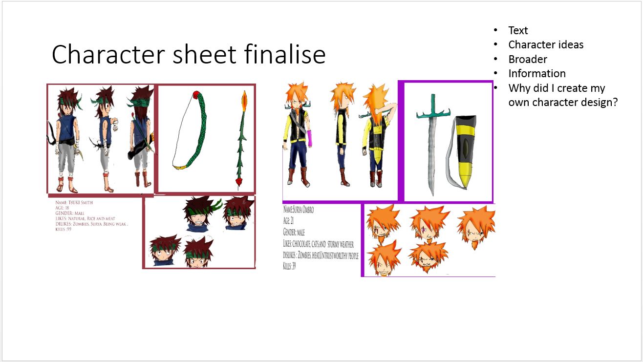
Slide 6: This is my character sheet design and it has shown both of my main characters. It shows the body position,head shots and weapon design but I should have changed the slide background to black because it would have reflected the character sheet design a lot better and it wouldn't look like it was glued to the background on the slides which I didn't want it to do.
Slide 7 : It shows the development in my comic design. I had to shrink them down so I could fit the other design on to the slide.It shows how I could progress for the future and which part to practice. I'm going to do my drawing daily from now on so I could get better for the next course as it makes it look a lot better for my work.
Slide 8 : This goes with the other slide (7). I have put some bullet points of what tools I have been using for my comic scripts.
Slide : Same with slide 8&7 .
Slide 10 : It is showing my poster design but it is only the development and not my final design. I have shown it on a piece of paper because I do not have the room on my slides and I don't want to remove any as they are good development progress .PowerPoint should have a tool where I could make my slides bigger, so I could of fit all my design on to one slides.
Slide 11 : It shows what I think about my work and I have checked my grammar as it did not look right before.
slide 12 : My peer Feedback
Slide 13 : All of my design.