Tuesday, 22 March 2016

broader of comic

 You click on this tab  which will lead to varouis of tools .

 
You cleck the line tool or you can do with the  rectangle tool but I decided to do it with the  line tool as it would be  quick and simple to create
You then click on the  pen tool which makes the line into a basci line which is weak then line before . I then right click ont to Make selection which would make visble  line I then put  paint can over the  line which create dark line so it could help me  where I can colour my comic 

 This is the outcome some are colour in because I am only showing the outline  as what it look like.


You then merage the layer into one so you don't go over the broader of your drawing,

speech bubble step by step


you frist go into shape tool and click on custom shape which would lead you to a bar  with different custom shapes ,web buttons, sign and many more shapes


This is different type of speech bubbles I did.

Then you create the temple and put it in the comic 

when you done added text with the texting tool which look like "T"

develop character (in Illstartor )

This his surya head shots showing different exsperssion and desiding  which is the better drawing out them for my  comic that i'm doing for my final majyor project. I like them all as i think they're all unquie sketchs and show differnet   expserssion on each  character in  my sketch .I have notic I have messed one bread on one head but I have added it back in photoshop which I be telling in another blog because this is my sketchs blog. I say the  3rd and 4th is my favourite , the 3rd one looks really determine   to fight and makes it look like the surya has different personaily  in each shot and the 4th I like big grins as I think it the best drawing out of the headshot.
This is when the body and head shot combination which I am proud of but I think should done better on the sideview and backview as I don't think as good as my front view but hopefully it might look good in full colour.On the backview Surya look small then sideview and frontview I should used a  sketch out ruler on the image.Iwill be adden is sword to the character sheet as well but I be colouring the sword  before I add it on the character sheet because so It would messed my design up for the charater , but the character looks old what he looks but  you do get these kind of people theses days as it can related to that suggestwised with people juging other people looks.
This my other character tsuki which is the character my favourite drawing as I found my unquie style of  art. The head in colour as been remove because I change my design abit because the red doesn't suit with the whole character and I have decide green as makes more of a warror in my character design,I think this is better then my surya 's character sheet as it had better drawing on the character .The bow arrow as been done on different blog with stages on it aswell which be coming up in a another blog .I have  re orangnizde the head around as I didn't like the drawing I did in my  frist sketch because some where kind of lazy sketches and didn't fit right with the proper sketchs on the sheet.They was  on sepera paper  before I then add them into one sheet  because I didn't want  to put my sketches on big  papaer as it would took me longer to draw on in illstartor and on paper.In the software I have used pencil tool and the size tools so I could get the right pencil size

Horror researchs


Link: http://movieblort.tumblr.com/post/119710735921/subjectivity-of-fear-why-am-i-not-scared
By:Peter Vidani
I found this piece of research very uncomfortable because of the eyes and mouth .I have  felt like the woman  is going to  eat me   alive in the picture .I think it as  been edited  in Photoshop  because how the  face as been  stretched  out  and  it has used the   liquify tool in Photoshop . The research has  inspired me for my final piece design  because it  could help  me decide on  my Zombie  design ideas.

Link: http://nevseoboi.com.ua/oboi-wallpapers/gotika/16241-gotika-11-62-oboev.html
By: готика / микс
I like this piece of work because  of this characters details that are   on the  face, which has been  created so the character  would look more creepier . It gives me the endless soul feeling  because of the characters eyes.This piece of work has  inspired   me to make my zombies look more creepier and make a  more darker effect on the  zombies.
Link: https://oparanormalblog.wordpress.com/2014/09/
By: oparanormalblog
I like this because it reminds me of the Grim Reaper  and I think it has been done in Photoshop  because of the smudging tool that been used  on the reaper's hood which makes you  think it  has  been done on Photoshop. It is a  really inspiring piece because it makes me think about my final piece  and how I could make it  darker and scarier  piece .I can't see anything wrong with the piece of work.
Link: https://morganlbusse.com/2015/05/10/my-mother-prepared-me-for-the-zombie-apocalypse/
By: Morganl bussse
I like this  piece of work because it reminds me of a game called "dead 4 life". I love the contrasts of  the  dark and light going on the hand and  background. It is a very inspiring piece, because it can  help with the  zombie ideas for my final piece of work.I think they of  should add a bit more branches in the background so it could have made hand more creepier.

link: http://vk.com/id271795881
By : Andrey Neytsel
 I like the details of the creature in the picture as shows a good  contrast on the creature which  looks like a man. The red glowing eyes makes it creepier to look at. It looks like  a  monochrome piece of work. It as  inspired me to make something like this  but I will  not colour the eyes red but yellow instead.


Link: http://www.tapeciarnia.pl/user_kaczorek?zobacz=komentarze&st=66
By:Kaczorek

I do like how they made the  windows glow because it  makes the artwork spooky  and the clouds should have more depth like the moon  because you can't see the clouds that much  .It has inspired me to  do more things like that. I could do a   background  like this  because it  would look cool.
Link: http://www.streetsofbeige.com/2014/05/creep-upcoming-print-by-godmachine.html
By: God Machine

I like this because it is very unique sketch because you can see every detail of the skull and  the hand but I think  they should have removed the crosses and dots which have been created into a  line. It would made the sketch  lot better because the artist made the skull and hand prefect  but not  the  background


comic fonts research

By:Marta Genes

I like these fonts because they are big and bold .I like how  the artist shows he/she style of  fonts  on each letter and number. I think they  should have  done a lower case  font as well  because it makes  the audience more intrested.
By: Unknow
I like these fonts because  it has shown  two different languages with in the letters .I think they are lending forward too  much and because it is  to closed in together and it reminds me  of the simpson's logos .I like the "U" letter as it remind me of a  eye.
Link: https://uk.pinterest.com/kesorenson1/superhero-class-party/
By:implytiffanystudios.com

I like this font because it is  very big for my eyes and I love the pop art culture, 
I have also found  this  very  unquie.
I can  tell it  has been  used  in photoshop because I can see someone using the pen tool and  the 
Anchor tool so they could  stretch out the letters, so it could  make it look  bigger and bolder.
I also like the dotted background but I think it should have been  done  in a different colour scheme 
 as I don't think it  fits with the font idea.


Link: http://www.idrawdigital.com/2009/11/tutorial-lettering-techniques/
By:Idrawdigital

I like the different style of the font designs and they are different from the black and white version of the font style. I like the "Seven swordsmen font " as I found it more of a manga style .I think the outline colour should have been more suited to the  letter,because it would have made it  look a lot better.I don't like GlassJaw and Lowrider as they are too much,  and they not my kind of fonts.


Link:https://www.behance.net/gallery/26322441/Sensei-FREE-FONT
by:Ezeqviel Ergo

I like this font as its kind of funky and cool.
Link: http://www.penciljack.com/forum/showthread.php?48660-Lettering-Sound-FX-Examples
By:Blambot

These comic fonts are really  cool but they have shown it in a  different style for each of the fonts.My favourite is the "matchstick and Skraash" as they are really eye catching to look at.
By: Fjalla by Sorkin Type Co
Link:http://www.cloverdesain.com/art-design/100-free-fonts-you-should-be-using-in-2015/

This looks like a noir or a pop art  kind of a font style because it looks like its from this kind of  era . I think the text looks  personal because they add someones address as if it should not be on there at all.

Magazine and Books research

Aurthor:Nanae.C.
Year: (2005)
Chapter : I will 
Company : In: Donovan.H 
Title :Peace Maker
contury :
Japan:
Publisher : MAG Garden Corporation. 39.

I've  find this one more helpful then the other reference   because It was  one of the easier research i did which   had good explanation in the information that was given. I took  this time period  clothes because I found them really cool clothes and I have decided to  put them onto my character design  as it would suit with my story 


Felton.P 
(2006). 
The ten commandments of Typography 
. london: Merrell publishers limited. 
14-15.


Fabry.G 
(2005)
 Anatomy For Fantasy Artists
 devon:
 A David & Charles Book.
 56-57.


flores.I 
(2011)
Sketch manga A draw inside step by step sketch book.
 2nd ed. 
china : IMPACT . 
44.

Monkeysurvey

 This is before I did my survey into  MonkeySuvery so I could check on my grammar and spelling .

2 weeks ago (Before)

After 2 weeks 
I have got a better results this time and  I am happy with it  my own survey .

This is the  latest  people who have done my survey . 
 These are  the  first people who did my survey.( 2 parts as I could not  get the full screenshots)
In my suvery there was more female response then they was male response. 
My age didn't went well because 2 people skip the question on my survey.
Most of the   was 18 to 24 and I think did mistake on this because I notice 16 not on there.

 I am suparised people like zombies  and nobody skipped the question.

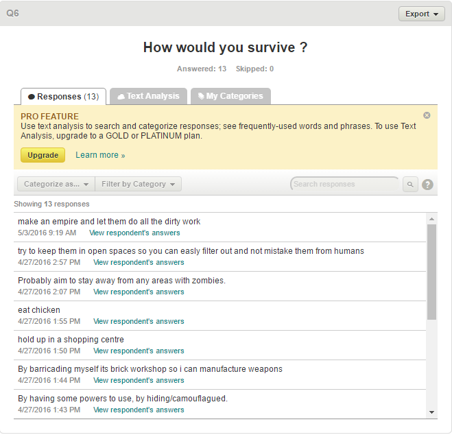
 I like people answer and some was funny . It give me ideas for my comic which I am doing in my FMP piece .
 These are my other result


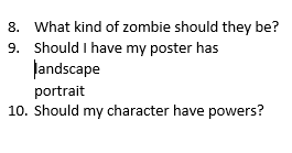
 I'm going to do my poster in portrait by looks of it.
 Bottom reseluts :
some people disagree and some agree but I am going to look throught before I'm going to do My character sheets in the  furture.

 Top ressults

 This would help descide which background going to go with my zombie poster.The abandon building got the most votes out  of the  suvery so I be doing the abandon building.
 Bottom results:
 Top results

This helping me what kind of zombies should I create and I found them ninstresting because then I can decide which is the better anser.
Looks like I'm going to do sword and bowing arrow because it got more result and I be drawing something new for my project