Thursday, 31 March 2016

Tuesday, 22 March 2016

evaluation
My assignment brief was to pick my own theme which I was happy about doing because it’s the last project I’m doing on this course.
I have chosen zombies because I like the whole idea of survival and zombies attacking people. It was a topic that I really enjoyed doing because I am into my horror movies but I'm going to do it in a manga style (which means comics in Japanese). My zombies would be based on the virus type theme.
I have done some primary research and secondary research. I have read some books which I did reference on and I have used a website called Neil's Toolbox which was a helpful website because it was easier to use than writing out by myself. I also watched some anime called Kabaneri of the Iron Fortress which is about zombies. I have read some manga comics like My hero, High School of The Dead which I didn’t enjoy reading but I did enjoy Zombie- Loan because it had comedy in and I do like my comedy in the manga. I have done some research on character sheets for anime and games. I have researched some illustration & graphic work which has zombies involved. I have done some more research on weapon design. I did some research on a character called Trunks and he is from an anime called Dragon Ball Z. I found the referencing more difficult as it was something new.
I have made a questionnaire on SurveyMonkey which I posted in a group on Facebook. I have got a lot of responses which I was very pleased with my results.
What inspired me was the zombies research, because it has given me more ideas on how I could make my zombies gory in my comic script. I have done some research on my favourite manga artists who have inspired me. The character design sheet from Metal Solid Gears (Game).
I had made some comic designs which have been developed into a graphic poster which I have been developing in Photoshop and Illustrator. I have created some head shots, body position and weapon design and I have been using them to develop into a big character sheet design. I had also done a comic design idea.
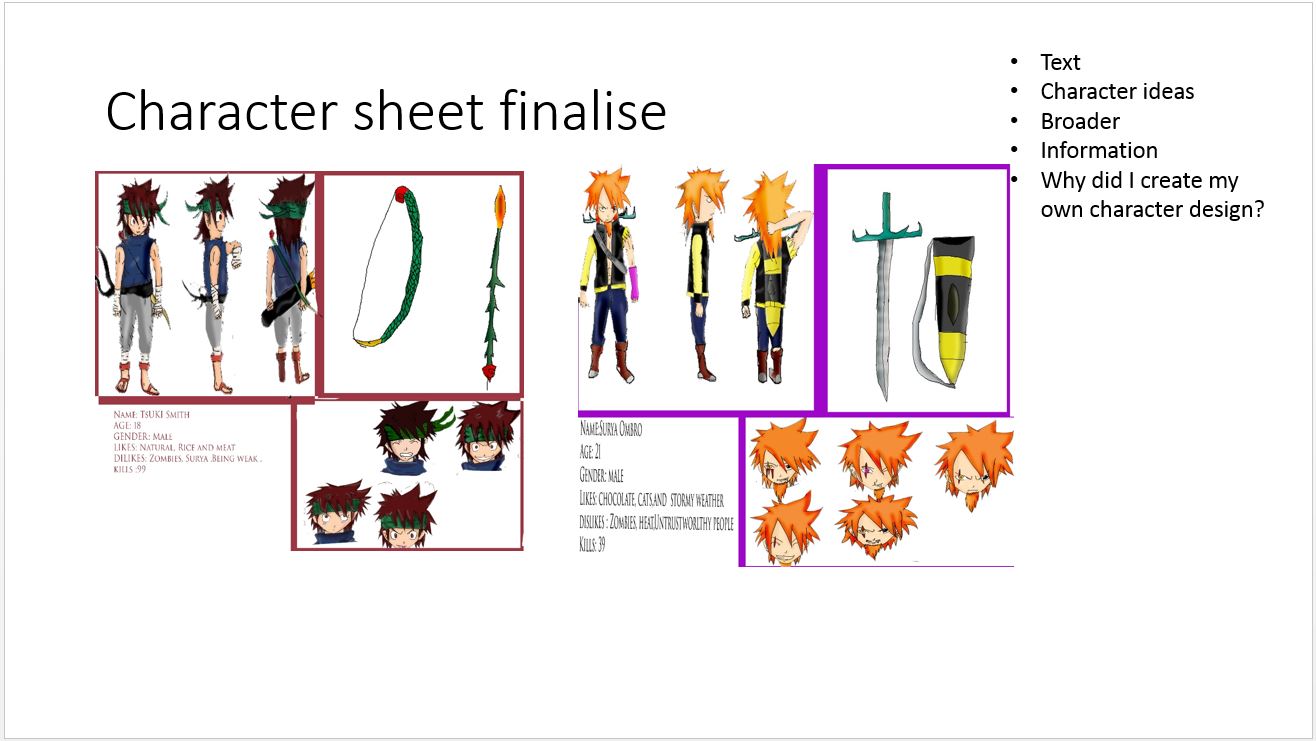
I have produced two characters called Surya and Tsuki, which I have been colouring in. Tsuki has a white skin tone colour and he is wearing a green headband and brown hair with red eyes. I coloured Tsuki’s top a blue eye colour and his trousers grey which suits with his white bandages around his arms and legs and his sandals are red. Tsuki’s bow and arrow are green, red, golden colour and flame colour. Surya’s skin colour is tan and he has got one golden eye and one black eye, he also got ginger hair. Surya has got a black and yellow shirt which is opened up showing his body muscle and Surya wears blue jeans with brown and silver boots. Surya has got a sword which is a dark grey and different shades of yellow colours. In the comic I have put a mix of colour for the background design. I changed the comics colour to black and white. I then added a blood shape tool which I coloured red, I have created a slogan in burgundy and black.
I have used Illustrator and Photoshop for my editing which I have enjoyed doing. I was using a graphic tablet which I draw in Illustrator. I have used a pencil to draw over my draft sketches. I have used Photoshop to colour in my ideas. I did not believe at first I would get it done by the end of the week, but I was wrong. I am proud of my development from sketchbook to Photoshop. I have done speech bubbles with a shape custom tool which I have used for several of my design ideas. I used the text tool to make SFX (sound effect) for my comics.
Yes, I have developed more new skills and I have developed my old skills which I am proud of doing. I have learnt new fill layer, burning & dodging, blending tools and the speech bubble technique which I have taught myself. The old skills I’ve developed are the pen tool and the lining tool. I have found the new layer tool quite difficult because you have to remember to unlock the layer before working.
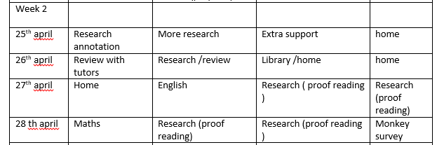
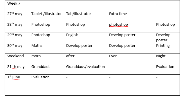
I followed my daily list well but I have changed some of my schedules, because I had a day mixed up, but I have done my work. I had to change one of my plans for a personal reason because I organised to put my presentation on a different date. I don’t like doing schedules because I like to plan it out when I’m on the move, much better than planning for the future.
Yes, I feel like I have done my best, as I put all my effort into my design. I’d say the weapon design and page 3 are my favourite pieces because they have been well developed and detailed. I am proud of my work.
If I could have changed anything it would be my logo design for my poster because I could have made a cool logo design. There weren’t many font designs on Photoshop which could have gone with my poster idea.
When I was making my final piece I struggled to get the pen round some areas so that I could colour in, as some were difficult to get the pen round the shape of my character, but I have finally solved it as I sat still and I think that is how I got around the area. I struggled a bit with fill layer because I couldn't get the eye colour; which was white; which kept going to the skin tone colour, so I decided to do the eye before or rub it out.
What was my final piece aimed at?
My final piece is aimed is at both genders because I did add a girl zombie in my comic and it is aimed at teens and young adults. It also aimed at horror fans and zombies fan out there and probably manga fans too.
My PowerPoint went well but it looks like I did four FMPS instead of 1 and I had some great feedback from other students which was great. I should have checked my spelling and grammar before I did it.


presentation


Slide 3 :These are my production slides and I have been using 6 slides because I have done 3 designs for my final piece which I have been working really hard on for last couple of weeks.The sketches are little bit faint because of the scanner I have been using in the library and it as been stretched to this size because it wouldn't be able to put the other work on the slides and it would make me do more work that I should of done.


Slide 5 : This is my weapon design slide.It looks good but the sketches could have been shown a lot better. It could of been down to the scanner I have been using and it was a A3 scanner in the library and it is a old scanner.I should have put more stages on the sword but I have forgotten to do it which I am kicking myself for doing.




Subscribe to:
Posts (Atom)