Tuesday 21 June 2016

End year show (Gallery )

 Me winning award.
 Me with a pint of bitter with my work at the gallery.

My work on it owns in the  gallery.
how your work was displayed ?

I like the display layouts but I think they should have  made my work a bigger  size than A3 as it was kind of small and not many people can see my  artwork. They  should have people's names and email address for a future  employer who want to sign  them  up for their company .

how you felt about it.

I enjoy the show but I think it was a bit cramp in the room and should of extend the room a little bit more.I was surprised that I have got an award because I did not expect it which I am happy that I got the trophies  as it looks shiny and I will be polishing it a lot now.The award I got was the  most improved student.

Monday 13 June 2016

Bengal culture and history

The culture of West Bengal is an Indian Culture which has its origins in the Bengali literature, music, fine arts, drama and cinema. People of West Bengal share their cultural heritage with the neighbouring Bangladesh.

West Bengal, home to legendary preachers, poets, saints, singers, film-makers, sportsmen and academicians, was once the cultural capital of India. Political thought slowly interlaced its web in the heart of the easily influenced Bengali and everything else took a backseat. Growth was replaced by grafitti and songs by slogans! Years of rallies, 'bandhs' and 'hartals' have taken their toll - Kolkata, the capital city, is now a shade of its former arrogant, proud and elegant self. 
The state still holds the depth of the ‘Bhadralok’, the intelligent, sensitive and cultured Bengali who has a desire for attitude, literature, music, football and/or cricket depending on the season. The people of Bengal love their heroes...Sri Aurobindo and Sri Ramakrishna; Rabindra Nath Tagore, Mother Teresa and Amartya Sen; tennis’ Leander Paes, and cricketer Saurav Ganguly, nicknamed "the Prince of Kolkata" for his sterling performances on the field! Satyajit Ray, the film maker, have become identical with Bengal. The people are also great travellers. Go anywhere in the world, be it off-season in Leh or Christmas in Montreal - there are bound to be Bengalis around. The social fabric is ranked and patriarchy is still the focal point of general family life.


trunks sword

Trunk is a dragon ball character who as came from the future and he carries  his  sword which he got he   from Taipon  which as been shown in  13 movies. I did not like the  story plot but  I did like the    fighting  scene as I enjoy seeing Goku fight in which he developed a  new move which I enjoyed in the  movie . I do like trunks sword because it  looks like it been very  detailed. I like how  Trunks handles the sword as he holds it  like a  branch .I would like to own a sword like Trunks  but I would probably  drop the sword  and stab my foot with the sword.
Link for the image : http://gopixdatabase.com/trunks+sword+ebay
Video of my research : https://www.youtube.com/watch?v=HQIJ8VzxLls

Thursday 9 June 2016

page 3


Black and white version : I think it makes a comic look cool and really detailed which makes it look like a good  manga page. The details in backgrounds are really good and they are  reflecting the comic really well. I have missed one speech bubble  of one of the zombies. The SFX(sound effects) could have been done a lot better for the  fonts. I had used the  desiderata  tool in Photoshop   which has been changed into black and white .
Colour:  It shows a differnet    emotion  from the other 2 pages. The  colour of the sky could have been done a lot  better as it  looks more  like a sea  then a sky.  The green part in the sky is supposed to be rocks which should been same colour as the wall colour.The  blending tool  should have made  it a lot better.  I have  really improved  on my last comic.

page 3 development


 This is my sketch on my  last page. This is my rough  sketch before I have developed my drawing onto a  graphic tablet.I have used my  sketch book,pencils, metal ruler  and some fabric colors which are good but if I had time to use them more I think it would look better.I  used  a  scanner to scan my work on a computer.
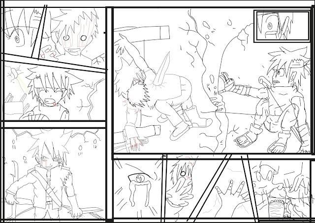
This is my outline  drawing.I have been  using  Adode illustrator to  draw out my sketch again which I have been  using a graphic tablet for my drawing. I have been moving  class rooms and  I did find it  peaceful for me to my work on.The border has taken some of the room on my sketches but thats how it happens..... . I have used a pencil tool.
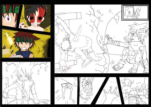
This is when I colour  my 3 sections and then I  colored them in which has made  it a lot more detailed. I have got used a filling layer tool after one week which is  difficult tool to use. I love the sun design  in section 3 .I have used a  different brush tool for the sun  which was called a Wet Sponge which is likes  a blends brush. It did go  well with my designs but I wish I could have  used the tool  on my previous work.  I  am  glad that I  found it out  and now I'm going use this brush tool  in  the future.
 I have finished coloring section  4 & 5. it is making progress on the page, I  thought it was  not going to  work  but it looks a really cool design and I like the eye effect more. I have used the same tools for my previous post but I did use the rubber tool to  rub out the  eyebrows so I could see it a lot better. I think the  blood should have  been done  a lot better on the  4th the section.
 I have finished my design on section 5th,6th,7th, part 8, & 9 are  really good. I did struggle on doing  my 7th because  I did not  know where the back of my characters feet were so I struggled figuring out where it is but I work around the problem. I also  noticed that I do good  toes even on 8th section they are both right footed. I  forget to add the bandages  which I had to add back on my character using photoshop as I didn't have Illustrator at home.  I like  the last section eye as it give the character an emotional feeling to him. I am beginning to like my page a  lot..
 The 9th section is coming along well and I like the blood effect on the zombie shirt as it shows two colour effects on the character. I've done the blood really well but  could improve on the blood a bit better . Tsuki (left character ) looks really good  and I need to improved my sideviews a lot more but I still need to practice which I am doing over half term for the next course.
 Section 9 has got a lot better as the background is added and I have used the dodging tool to make it a lot better too . I like the light and dark part which shows  two different sides of the story. I think the character have been  developed well in a short time.
This is my comic script and  it has been checkd and corrected by a Teacher assistant.I have created the speech bubbles in photoshop by  using the custom shape tool. It has more of a  variety than  CSS than  CS2.So I  had to wait  untill  I got back to college which took some time.

Wednesday 8 June 2016

page 2 finsh

Colour vison : The bubble speech in the last section on the zombies could have been   done a lot better as you cannot   see  much  of the text idea. It is  my fault and I should have fixed it up before I published it. .I think page 2  looks better  than page 1 designs as it has got a lot more detail in the designs which looks like I have improved each time I have drawn the comics.
Black and white version : I think  it has  made the blood  a lot more detailed  and it not showing up as much.

comic 2 development

This is my skeatch design on  page 2.I have  used a pencils,ruler and rubber to  design my comic page. I have designed it by  myself  as I didn't use any template for this. I am proud of  my work because its how I  developed from  just 4  years ago as that was when I   started drawing manga. I would like to  still  carry on drawing because in want to get better in drawing my own characters.

 I did my  comic pages  in CC Illustrator  which is a lot easier to use.The software has  helped me draw my ideas on the computer but if I did it in Photoshop it would look like a big mess which would have caused some  trouble. I think it looks a lot   better then the  original drawing  as I have been improving on in my design.The outlines will be colored in photoshop which would  makes it more  easier for me  to colour in the border of the comic .In illustrator I only used tools like  pencil  & the Lining  because they were   the only tools I needed.. 
I have done my  sketch on illustrator which looks better.Now I  have  started colour the page  in Photoshop which I found it easier then using illustrator to  color my comic page. The first 3 section on my page  has been colored in.I do  like the zombie as it is the best character I added colour in my comic page    not in the  other 2. I have been  using the fill layer tool which is like a solid based colour tool, before  I used the  brush tool to make a some shading for the character so they would look more detailed. I have used  different brush techniques for the shading in the characters. I have used the  burning tools and dodging tools  so  I could make  more  detail on  my  characters & backgrounds designs. I then  used the  blurring tool so I could blend them with my characters design so the rest of them didn't look like as if they were  too solid . I did struggle on the first section because I did not know how to  make it gorey looking but I did figure it out by playing around with  the colors .
This is when I started coloring in my final scene before going on to the 3rd page.It looks like the characters are coming alive which is very cool to look at.I do like how I  shaded in  the characters as it makes  it  look manga like.I have used the  same tools on the  picture before this stage. I did struggle with the lines being missing on my page which was a stressful job to overcome and I did find away around it.


I have finished my zombie and the other main characters which have made them look more alive. The background has made it look like my character  as been split in half but it is  the first half of  the background idea. .I did not struggle with anything on this part  because  I was starting to learn about the   tools.

full comic page 1

  This is my  black and white version of my comic design. I did it in black and white because  I want to see  how my comic looks  and I was wondering which one  has the most  detail on the comic design. I think  black & white for younger viewers but  not for the  older viewers. I added text by using the  text tool in photoshop. It did not have very good font techniques because they where boring to me but I did find a website that did fonts but you  had to pay for the fonts and I only  wanted  a free sample.I had my  grammer checked by  a tutor  which helped made my poster to look better.
I do have a development page but I did it on different blog because it would not fit on my other blog so my two fianl comics had to be on different blog page .To read the comic I will be looking at my artwork so i can improve on my drawing skills a bit more..