Wednesday, 13 April 2016

Horror and dark illstartion and grapthic

LINK:http://www.vg247.it/2014/07/21/darkwood-il-gioco-horror-su-steam-early-access-si-presenta-con-un-trailer-interattivo/
by:Da Valentina Di Martino
I like this background of the tree branches  behind the logo which have  made it a lot  creepier which  gives it a  dark feeling towards this piece of work. I think it  should have  been done in a different colour then the  titles look as if  they are  connected together. They need to make the shadows more  3D ish  because it looks too plain.
link:https://vk.com/wall-34359494_1468
by:bottomless pit
I like this drawing a lot because of the  details and  the  coloring idea which fits with the artwork .I think it is representing a  grim reaper because of the skeleton in this sketch idea. I do like the glowing eyes in the grim reapers eyes because it makes it a really dark and spooky sketch. I don't think there is anything wrong with the artwork.
Link :https://www.behance.net/bebber
By:Federico Bebber
I like the  females skin  which as  a lot of detail on her which I like about the  picture .I think it has  been edited on Photoshop   because of some blurriness on the  cracked skin  which has made  it look as it has   been done in  Photoshop .The  nose part look  shiny, as if it has  been done  using the levels and the curves tools so  it could have  made it more detail.

Link:https://uk.pinterest.com/billengelhardt/cool-art/
By:Geektyrant
This poster looks very old because of the style idea but I do find this artwork  really  unique and I think it was made in the early 70s because the colour designs  make it  looks more  detailed than it was from the  50s . I like the idea of this zombie theme  but I like the virus theme  better  because I think it has a better story-line than the one raising  from the grave stroyline.

Links http://www.vgblogger.com/monster-madness-grave-danger-date-change-new-screens-and-art/3039/
by:MATT LITTEN
looks like the character has been  drawn in illustrator and been colored in Photoshop. I found this character very as  it is different from   the blood and gore  type of zombies.This zombie looks like it is  aimed at kids more than  it is aimed at adult and teenagers .The shading looks  really good but could  have put more highlights on the characters design.

Link::http://www.thementalshed.com/projects/slasher-bob/
By:Charlie Hintz
I think this looks   spooky but they are  very cute because of the little characters are  standing next to the slogans. This is advertising  for  a website and  I do not know what  is it  about but I guess it has something to do with the  Halloween season  as the themes does remind  me of that season.

wepon design research

link: http://www.paperhi.com/Toplist_Best_311/download_2560x1440
by:Unknown

I like this weopon because  it shows a really  good  detail on the bowing and  arrow . I like the golden and black colour of the weapon because it makes it is a  really nice weopon  .It looks like it is hard to draw as  the detail it  self as been through out .
link: https://uk.pinterest.com/pin/332281278732661916/
saved by :Macaulay Hayward

I like the styles of the weapon because it show of the artist  skills and technique on the  weapons designs.I like the 1st,4th,5th,7th,8th and 9th because of the detail of the sword  is very uniequie  with the shading.It makes the  swords had more  detail more to  it. I don't like the 10th sword  because it is kind of messy and I think it should of  been on the sword.
Link :http://annieleonhardt109.deviantart.com/art/Silent-hill-oc-Annie-592332014
By:Reki Kawahara

I like the way it  shows the  exstended version  of the swords and I  love the detail but the left  sword looks like a final fanstay xii 's logo design  and I do like it because it is very differnet from the other swords.I like the shading of the sword as it show a lot of  detail  of the sword but on the left side of the sword  they shouldn't had it in white shading has the Artists   could of done it in a  lighter grey beacuse it is  more of a sword colour .


Link:http://s704.photobucket.com/user/blackkitten_of_darkness/media/Wen-M/Wen-M%20weapons/sword_designs_by_Wen_M.jpg.html?sort=3&o=21
By:Wen -M

The 1st and 2nd sword as been anntateded above so I wont be doing them.I like the middle sword  because it as a really cool  colour combinations but they could have done the highlights more better because it is kinda of messy and should of been netter with the main part of the sword.
I like the red  sword o because it is a glowy  colur  but they should of added more a dark puple to the sword  because I feel it is lacking on the  dark shades.I don't like the yellow on the  sword as  it is not my kind of  a colour for a sword.
link:https://uk.pinterest.com/pin/420805158907280350/
Save by: img.neoseeker.com
I like these bow and arrow because of the style of thoes  weapons and I like the  shading  on the weopon as it is  really neat. I feel like should be on a display because they are  so cool another to be on  a dsiplay.The 3rd bow remind me of a pokemon.

Link: https://xamhinhnghethuatdep.wordpress.com/2016/03/05/hinh-xam-mui-ten-doc-song-lung/
by: Michael Hussar,into a  leaf  .You could of used it to send messenger to people .I think the arrow it self should of  been equal length  because it is a bit of sided arrow and could  of done it  a lot better.
link : http://game-weapons.tumblr.com/post/13603195974/rough-concept-sketch-of-bayonettas-signature

By ;Bayonettas

I like  these guns because the are really good designs for a gun . The 5th gun should of  been sketched better because it looks messy and  it is missing some sketches on the gun.I like the 4th gun better because the leaf makes look like it is  growing out  of the gun and it is a really cool design.They shouldn't made the handel white becauces it should have been done in a  burgnay colour so it looks more contected to the weapon.
Link: http://indulgy.com/post/YirBO9V6H2/illustrated-arrows
By : sharene
I like the designs idea of  the arrows but I think they should  of made the arrow  more flat  in my opioin .On he 3rd arrow onthe right is nice with the black and white idea but  they should of not done a  blue colur leaf as it  doesn't suit with the  arrow idea. The 1st arrow  looks like it as been rushed throught because it is not a straight  arrow  and should of  used a ruler on photoshop.The ruler is  there to help people with the stright lines .The middle sword looks better but  there is a big bum what is kind of bothering me as it looks disconnected.
By: Xin sister

I like the swords ideas but I  would love to see it in colour because it be a different  colour from just a grey coloured swords.I like the 4 th sword the most because the detail is like a angel design  and it been thought out well.


link :http://www.belagoria.com/2009/09/disenos-de-dagas.html
Artist: Unknown

I like this dagger because of the   snake  grabbing the handle on the dagger.It looks  like the snake  owns the dagger and I think it is a cursed blade because  of the  snake is looking at you  .I think it should have  a colour version.

Link : https://plus.google.com/u/0/communities/106122806775269615411
By:Brian Harris
I found theses sword amazing becauase of the  lace hanging of the  handeled. The colours fit well with the weapon. The secound one should had remove the pencil mark as I can still see it.

Link:https://theprojectatelier.wordpress.com/2012/10/01/elk-weapon-set/
By:Cheungygirl

The design idea reminds me of zedla  because of the logo what goes onto the shiled.I think they  should of done the blade bigger because it is small and cannot see much  detail on it.The shading makes the weapon more 3D kinda think


Horror/Gothic fonts

Link:https://uk.pinterest.com/timmurphy539/dragon-alpabet/
by:Font101.com

I like the dragon style fonts as it make look like a game of  throne kind of theme . I would do this fro my idea because it would make it too much for the characters.

 Link: http://www.flutewind.com/photoxvns/tattoo-writing-styles-old-english
By:Unknown

I do like these fonts as they are really cool and they are different kind of fonts which are from the old Victorian time kind of text .It does remind me of  anime called Black Butler because they had smilar kinds of font ideas.I would like to  use this kind of font for my poster title because it makes my final piece more creepier.

Link: http://www.identifont.com/similar?NOH
by:Hubert Jocham

I like these fonts styles because they are a more  flexible  kind of font that looks easy to do if you took your time,but if you rush the font style  it would be hard to do. I would not like to do this style as it be more of a relaxed  font for my poster idea.

develop into a grapthi piece

Adding my two main characters.
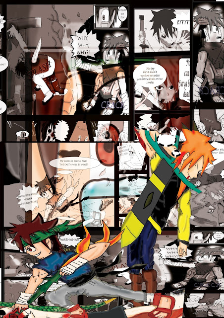
 I did struggle to fit the comics on but I decided to mix them all up so they could look good and random.
I then added the eye from page 3  which made it look like you are zooming into the eye itself.


 I have used the blending tool to make the eye fade as I didn't want to show  too  much detail of the eye.


I have added a slogan and some other tools like lighting and flare which can make it into a cool poster design which  makes it look effective within the background design.I think photoshop should have more flare tools as it would make my poster look a lot better.
This is when I'm deicing if to invert or a red background. I have created the slogan which I think looks kind of weird to me. In the end I did decide on my poster idea .
I have added blood templates to my poster instead as it looks  better then the invert and red background design. I have removed the green colour on my slogan as makes it  more blood like.I do like the poster now.
I add the title of my comic and it is in the  invert colors

sketch character design (1 & 2)

This is outline of my character sheet which as i ve  drawn by myself with Grapthic tablet and software called illstartor which makes the line nitter and tidyer for me to go aroudn the ruft drawing and  How I could fix my mistake  in my ruft sketch which I have develop in

This is body postion which I am pround of the design but I think should made side-view eye smaller because it took big for my stand or it my style . some lines are missing on the character which is both for me colouring it probly I made it too small for me to draw around and some lines got added which  looks


comic script page 1 developing


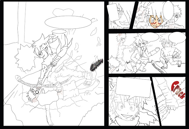
This is my sketch and you can see I have made some mistakes and the coloring looks a bit rushed, but I have fix them in photoshop which has helped me to  develop my ideas more. My design  has got  more gorey  than the drawing - that is  what I am aiming for . I have used a A3 sketch book and pencils  and used  gel pen to neaten up the drawing more  I have used a  metal ruler which has made it   a lot easier to draw in the boxes of my idea 


This  is my digital drawing in illstartor and I am very proud of the out come as looks very cool and I am  very proud of my comic script. I have  been using the pencil tool and rubber tool  which aren't  as many tools but it did take me hours to compelete it  and it was difficult getting the tablet but I wish  I could own one but they are expensive. I will be adding  my speech bubble text and SFX (Sound effect) after I have done coloring in the comic as I would know where to put it and not let the colour mess up the  SFX  text.


This is when I colour in the  outside boxes in photoshop which was easy to do and Photoshop is good for editing things like these.Some parts have been taken off because  only the outline  would fit on the  page.


This is when I have started colouring in photoshop.  .


This  is my development  with the  colouring on my zombies in which are looking cool .


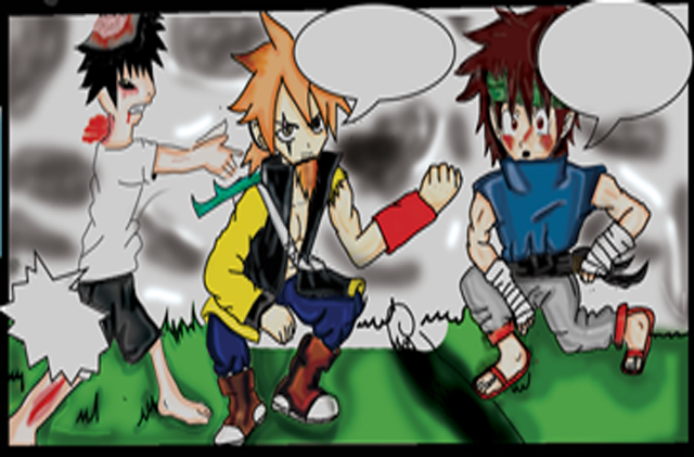
 I have started colouring on the  3rd section and Tsuki (left side) looks good  and I would have done  some better shading on the clothes as they look a bit scruffy.


This is the  3rd section of page one which is blurry as I used the cuting tool to  paste it onto a new page in Photoshop which I would do again. I will be adding text after  I have done my colouring because the coloring would take over the writing and I don't want that to happen. I have  used a new fill layer to make the base colour of my character   I then used a brush tool to add light shading to the characters  then used the burning and dodging tool to bring more dark colour and lighter colour to my character . I have used a pen to  pick area that needs coloring  I have  also used the adding anchor  tool so I can make it tidier for me to colour I have used the blurring tool to blend with my character tones so it  doesn't look like the  shading colour  takes over the base colour of my characters.I really like the outcome of my comic as it looks more anime  which I didn't think it would happened out like this  because I through it might have been dull .


This section 4&5.  I like the  grabbing of the bow and  arrow as looks a really effective piece of work because  the flames are really active  I'm really good at coloring flames with crayon so it would have made  it look 10 x better in photoshop. On the 5th background  something is going to happen as you can see with my character tsuki grinning  as he his ready to attack. The  zombies on section 3  the bandanna shading looks as if it is reflecting his evil move that he  his going to make which is on section 6. I did it yellow because I want to make it stand out with the characters emotion for the move.


I think the last section has really good detail which has more than my other drawings and this is my first page so it would be a little  rough. I like the blood effect but I wish I had  made it more gory as I think it looks too basic.The background shading looks more detailed than the character which I wish I  could have  done better on my design .The speech bubbles  suit  the action on the section which I layed out well for my design.


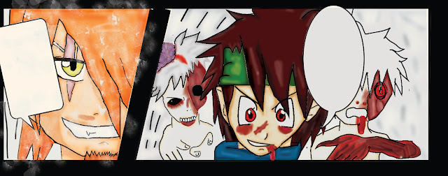
This 1st section and 2nd . I like the zombies design on the first one as they look really gore.y
  I'm really proud of the effects of the blood and I think I have done the  brain better because  it looks more like grapes then a brain . My character Tsuki (middle)  really is standing out.In the second I like the grin as it looks evil which I'm trying to make people think because of the scar on my character Surya who on section 2 . I wish I hadn't added the snow as I was trying to make a rain effect  that has failed. I was struggling to do this because it was half term and I don't haveaa tutor to  ask   about my work ideas.